
Solution
I redesigned a standard fast food kiosk to feel less cluttered and overwhelming by leveraging the benefits of kiosks — clear visuals, personalization, and an element of guided discovery.
Challenge
Explore the world of contactless ordering post-COVID for ways to improve existing kiosk designs.
Duration
May — June 2022 (4 weeks)
Role
UX Researcher &
UI / Visual Designer
(Individual Project)
Background & Research
In order to immerse myself into the world of contactless ordering, I visited different places with kiosks, ranging from sit-down sushi restaurants and boba tea shops to fast food chains. In addition to using the kiosks myself, I observed other users' experiences and recorded each step of their user journey. Afterwards, I conducted a structured interview about their experience.
Growing up, I didn't eat out very often. Even today, I feel overwhelmed when presented with an unfamiliar menu; there is a lot of text to digest and many options to compare, but only a short window of time to decide.
While self-ordering kiosks are still relatively new, I have really enjoyed using them. When designed well, the visuals are very helpful for scanning information. Order customization is easy, and you are able to explore the menu at your own pace. Generally, they feel less cluttered and easier to read.
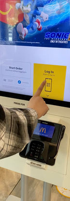
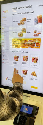
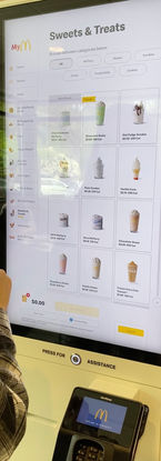
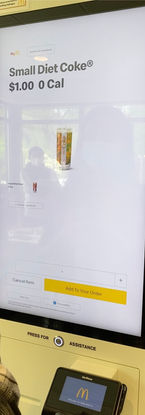
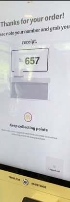
A step-by-step view of the ordering process from a McDonald's kiosk in Bothell.

Examples of different kiosk designs from other places I visited. (Left - sushi restaurant, Right - boba tea shop)
After conducting my interviews, I realized that the existing benefits of kiosks could be leveraged in other ways, such as the ability to gently guide users; to personalize the experience of browsing a menu; and to improve the discoverability of otherwise "hidden" items.
Here are some notable quotes from my interview that led me towards these ideas:
"The contactless option makes me realize there are a lot of items I haven't tried before . . .
I didn't realize that McDonald's had a 'frozen drinks' option until today. I'm able to see more things on the kiosk."
"I prefer kiosks because I am able to see everything visually, and can customize my order.
I don't feel rushed compared to when I order in person."
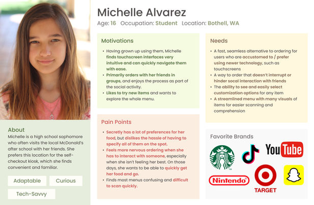
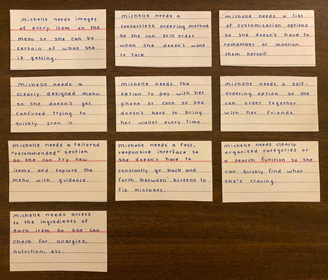
To help organize and identify my goals during the design process, I created a persona and corresponding needs statements.
Concept
In my redesign, the kiosk's interface is simplified further, and different items are prioritized depending on factors such as the time of day and previously ordered items. I wanted to make sure the menu didn't feel too immediately overwhelming. However, if a user knows exactly what they want, they can quickly jump to it through the side menu that is always accessible to them.
I included an additional, speculative feature that allows guests to take a quick survey to set up a personalized menu with their preferences, taking into account both the flavors they like and dietary preferences. As users return, their feedback on items (such as favorites and ratings) can be used to recommend similar items to try.
This design aims to guide users around the menu, starting with what they already like, and encourages them to explore at their own pace.

An early wireframe showing the flow of completing a customized order.

A few screenshots of the final design and prototype.
Prototype
Below is the final interactive prototype I created in Figma, refined after some usability testing in class.
Reflection & Next Steps
Though the time we had to work on this project was short, I learned a lot from it! Our professor was very helpful in giving us thoughtful feedback throughout the process. Thanks to the advice I received, I still consider this one of the most insightful UX projects I’ve done.
Our last few classes were spent sharing and testing our designs. Here are some additional insights I have gathered to potentially improve the prototype in the next iteration:
-
The ellipsis symbol is ambiguous, and requires a click to fully understand its purpose.
-
Some buttons can be reworded to be more clear and concise.
-
On some pages, the onscreen layout seems so complete that it isn't apparent there is more content below the fold. It may be helpful to deliberately cut off some content, similar to the horizontal scrolling cards.
-
Another solution could be to add a slight drop shadow to the bottom bar, so the back layer appears to go behind it. It is subtle, but can intuitively signal to the user that there is more to see.
-
Consider a different design for customizing ingredients. The + / - buttons are small and will likely be difficult to press. It may also be more intuitive to use a model that removes what is already there, or adds what isn't.
Completing the process of researching, prototyping, and testing within a few weeks felt challenging at times, but was worthwhile. I was so grateful for the opportunity to complete this case study and learn from someone in the design industry.
I look forward to incorporating what I've learned in future projects!
